Podcast Site Redesign -- I'm Now Using the Leia Theme
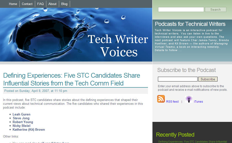
I redesigned the Tech Writer Voices site with the Leia theme. I like how it looks, even though I think the code in the Leia theme isn't the easiest to work with.
Mark Ghosh, who recently mentioned my site on Weblog Tools Collection (thanks Mark), describes the Leia theme as follows:
Well put together, two column, striking, well structured, featureful theme for Wordpress. Very goth (?) undertones and very cool and different look and feel.
I agree with his description — striking, unique, rich, intriguing, goth (with the original picture anyway).
But here are the following problems I've run into with the code:
- The site didn't fit into a browser window (half inch too big -- had to fix that).
- The light blue "Subscribe to the Podcast" section was missing from the theme files (I had to pull it from the author's live site by grabbing the underlying style tags).
- The comments section under each post kept getting messed up with the inclusion of the Subscribe to Podcast section (not sure how I fixed it -- just wrangled with it enough).
- The links in the header are actually in the sidebar (the sidebar file is odd -- wish it supported widgets, but my guess is no).
- The sidebar content aligns differently in Firefox than IE (still haven't figured out a solution to this one; I'll probably change this section anyway).
- The section at the bottom of the sidebar is still misaligned (need to tweak it).
- Trackbacks don't align perfectly under a post.
- Seems like there's a different div style tag for every element
Still, I think the designer did a beautiful job, and even though the style tags are in Spanish (which can be frustrating for some), I liked the theme so much that I was persistent with it. (Please don't tell me you hate it.)
I guess the design of a site has little to do with the quality of the podcast, and users don't even need to visit the site anymore. Still, I wanted a web facelift for Tech Writer Voices.
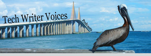
I originally planned to use this picture my friend took of a pelican next to the Sunshine Skyway, because I felt it represented so much of what I love about Florida, and it is a scene I am constantly immersed in (part of the appeal of fishing). In fact, today I was with my two-year old Callie and we were on a dock 5 feet away from two big pelicans.
(I may still add this image to the About page.)
However, the image drew confusion about the bird. Pelican and podcast? Didn't quite make any connections in my mind, so I used the beautiful, rich blue water drop that the theme author included instead. The water droplet communicates more of the message of the podcast, which is that your voice matters. You may feel insignificant in the global scene of technical communication, but in fact one voice (whether through a podcast or blog) can have a magnified effect. I'm the prime example of this. Had you ever heard of me before my blog or podcast? Yet through these two simple mediums, thousands have read and listened to my voice. That's how Web 2.0 is — it decentralizes authority, enlarges the importance of the individual, and makes real-felt waves that ripple out towards others, even though it's just one tiny drop of water.
Plus it's just a cool close-up of a water droplet.
I still have some more work with the theme, but you'll notice that the Subscribe section is where the main focal point is — that's because I want new readers to subscribe. Once you're subscribed, you get the new posts in your inbox or feed. But for the newcomer, subscribing is the main goal.
Of course that leads to the question: what am I doing with all of these subscribers? Not sure yet. It is one measure of success, I suppose. But it also makes me think twice before I click the Publish button.


