Nicely Designed WordPress Blog — Simple, Lots of White Space
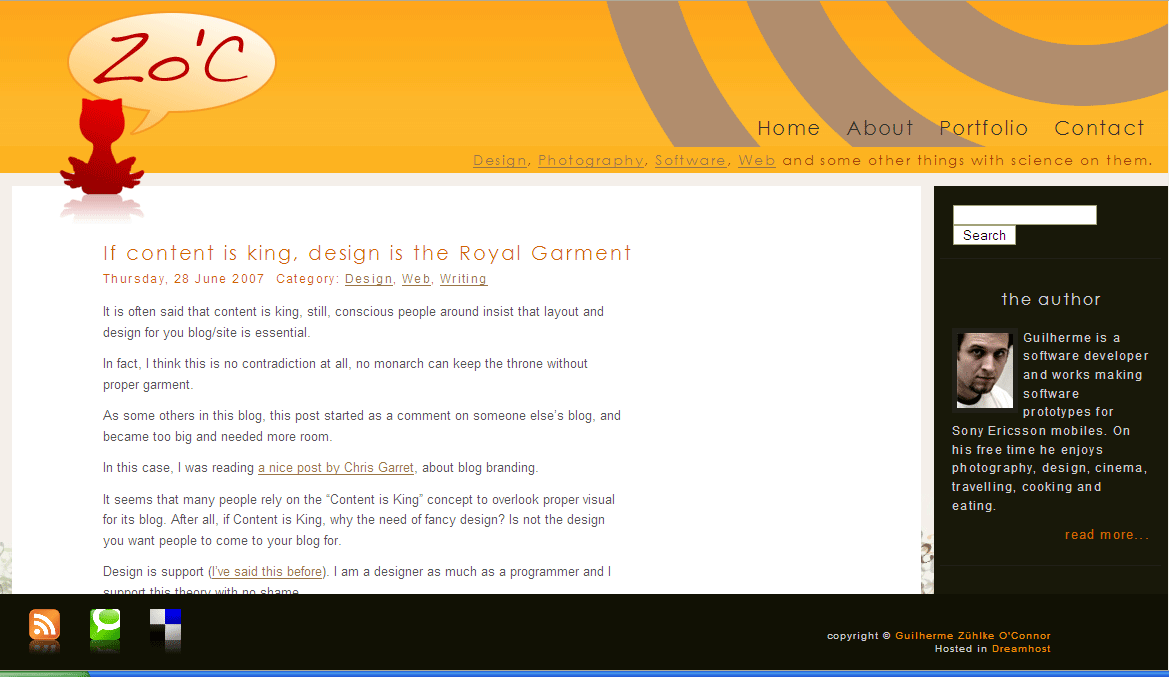
I stumbled across a well-designed WordPress blog yesterday. It has several qualities that make it stand out:
- Ample white space
- Simplicity of design
- Contrast between headers and paragraphs
The ample white space and openness of the design is what I like the most. The cat in the upper-left corner (is it a cat?) and the author's picture on the right also provides a nice balance.
Ample white space is a key principle of graphic design. I think often times we tend to jam layouts with as much text and graphics as possible, using all available space. In contrast, almost every time I see something designed by a graphic artist, the text is not crowding the space. Rather, the abundant white space draws the reader's focus to the text.


