Quick Reference Guide Formats -- Tips for Finding Attractive Layouts
Quick reference guides provide one or two page condensed instructions. Formats for quick reference guides vary dramatically and can involve complex, multi-colored layouts, or just simple text callouts next to a few images.
The other day I stopped by a local thrift store (Desert Industries) and picked up a few magazines for $.25 cents a piece, looking for attractive layouts that I could use as quick reference guide formats. The format most appealing to me was this image from Fast Company:
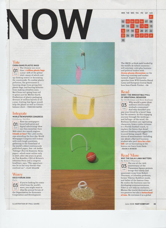
I used this layout as a guide in Adobe InDesign and created the following quick reference guide format:
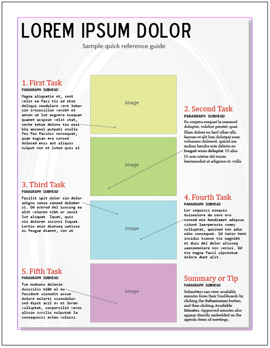
(By the way, here's the Adobe InDesign file if you want to use this.)
Notice several elements of the layout. The red task titles contrast sharply with the text beneath them, as well as the paragraph subheads. Also, the text is placed near the image it refers to, with an arrow that leads the reader's eye down the page. Additionally, the tasks are aligned vertically so they have equal spacing in the margins. I haven't crammed too much text on the page -- the white space allows it to breathe.
The purpose of this quick reference guide is to provide a snapshot of a complicated-but-frequently-used task in the application. It's not intended as an overall how-to for everything -- just a popout of a process users may find confusing.
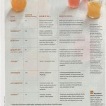
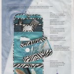
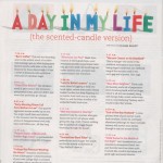
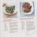
You can find a lot of ideas for attractive quick reference guide formats by looking through magazines. Here are few of the other layouts I found:
A colleague and I are presenting on quick reference guides at the next STC Summit. In preparation, I'm trying to gather as many attractive quick reference guide layouts as I can find. If you have any, feel free to send them my way. See my contact page for how to contact me.


