Good Designs Have Strong Contrast
Since I've been reading The Non-Designers Design Book: Design and Typographic Principles for the Novice, I've started to see the importance of contrast everywhere. The author, Robin Williams, argues that contrast is one of the four pillars of design, and that most people don't include enough of it. As a result, rather than contrast, they end up with conflict. Williams writes:
A design is in conflict when you set two or more typefaces on the same page that are similar -- not really different and not really the same. I have seen countless students trying to match a typeface with one on the page, looking for a face that “looks similar.” Wrong. When you put two faces together that look too much alike without really being so, most of the time it looks like a mistake. The problem is in the similarities.
Although Williams goes into detail about contrasting typefaces, the general idea is to push contrast more than you might be naturally inclined. If you don't, you end up with conflict. The next time you eat at a restaurant, look closely at the menu. A good menu has a high degree of contrast between sections. A poorly designed menu usually has the titles in 14 pt Times New Roman font with bold formatting, followed by Times New Roman 12 pt font for the menu items. Boring. Williams writes:
Don't be a wimp. Most effective type layouts take advantage of more than one of the contrasting possibilities. For instance, if you are combining two serif faces, each with a different structure, emphasize their differences by contrasting their form also: if one element is on roman letters, all caps, set the other in italic, lowercase. Contrast their size, too, and weight; perhaps even their direction. … For a wide variety of examples and ideas, take a look through any good magazine. Notice that every one of the interesting type layouts depends on the contrasts. Subheads or initial caps emphasize the contrast of size with the contrast of weight; often, there is also a contrast of structure (serif vs. sans serif) and also form (caps vs lowercase) as well.
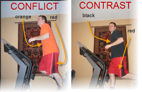
We already understand the principle of contrast in many other aspects of our lives, such as how we dress. In the following image, the orange-red color combination is hideous, but the red-black combination -- which has a lot more contrast -- is more acceptable.

When we dress, we automatically choose clothes that have some contrast, even if we're not designers. It's natural, yet we don't always carry over the same principles into layout and design.
In the next photo, look at the color of the jackets -- pink and brown, purple, and black and pink. The jackets on the outside have strong contrast, and the the colors work. The jacket in the middle lacks contrast. But rather than purple and light-purple, or purple and aqua, the designer chose to keep the shades pretty much the same.

The solid purple jacket works, but will need contrast from pants, gloves, or a hat. (Of course, my kids look cute no matter how I dress them.)
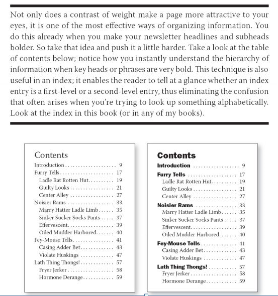
My point is this: if we take our natural sensibility for contrast that we automatically employ in dress, and then apply it to layout and design, we'll naturally make documents that have greater appeal. Here's another example from Williams' book, this one about table of contents.
Start looking at contrast and you'll see it everywhere -- store signs, book jackets, billboards, TV titles, logos, magazines, labels, dress, and more. The designs that catch your eye will have a good deal of contrast.


