Visuals Engage Users -- Why Aren't There More Illustrations in Help Content? [Visual Imagination #1]
At the last STC Summit in Dallas, one of the most attended sessions was Don Moyer's Building Visual Explanations: Practical Advice for Writers. I was recently listening to the recording of the session. I've been feeling more and more lately that I need to develop my visual imagination.
Illustrating concepts isn't difficult, Moyer said. The hard part is coming up with the idea of the illustration, the napkin sketch. The rest is just "fancy execution," he said.
The fancy execution requires mastery of programs like Illustrator, Photoshop, Visio, and other graphics tools. We often lack the talent to convert our sketches into professional-looking illustrations, so we don't even start with the napkin sketch at all. We usually throw in a few screenshots and call it good.
While screenshots are important, visuals that illustrate technical concepts are necessary for engagement. Visuals communicate an idea that is otherwise lost in paragraphs of text. Users may skim and scan text, but their focus moves right to visual, because that's how our brains are wired.
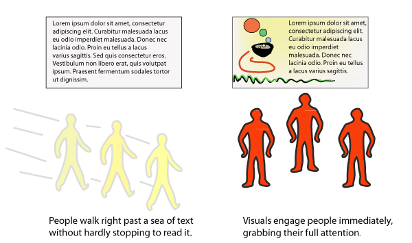
In the above diagram, the visual isn't just a picture; it illustrates the concept I'm trying to explain. That's what illustrations should be -- visual depictions of a concept. Brainstorming the best way to illustrate a concept (kind of like playing pictionary) is the hard part, according to Moyer.
Converting the above napkin sketch took me about an hour in Illustrator. I found a picture of a walking man and a stopped man in Flickr (pictures from a crosswalk sign). I added them as a layer in Illustrator and then used the pencil tool to trace an outline. Sure they look kind of like blobs, but they communicate an idea.
Our lack of visual illustration is probably why most help content is unengaging and dreadful. We spend too much time talking about styles, re-use, TOC organization, and parallelism without addressing the actual content of the help, or without considering the rhetoric of our content. Visuals engage users; they instruct and clarify concepts. Why would we omit one of the most important aspects of help?
I'm starting a new series called "Visual Imagination." Throughout the series I'll dive deeper into methods and techniques for illustrating help content.


