Making Help Content Enjoyable to Read -- Impossible Quest?
In my previous post ("Less Text, Please"), I argued that users want shorter texts. I also explained how social media and Internet sites have possibly rewired our brains to incline us toward shorter content -- according to some, our gnat-like attention spans can only consume a few short paragraphs before tapping out. The Onion has a great parody of how a single block of uninterrupted text causes mayhem for readers ("Nation Shudders at Large Block of Uninterrupted Text").
But while short texts are met with smiles and cheers, many of my blog's readers suggested that raising up a standard of brevity may be misguided. In fact, in many contexts, readers don't mind long texts. What readers truly want, they explained, is simplicity, and simplicity is not always achieved through brevity.
As long as we strive for simplicity, illustrate our ideas, and focus on business relevant content, perhaps even the most technical user's guide (such as a Network User's Guide, shown below) might become as pleasing to read as a novel.
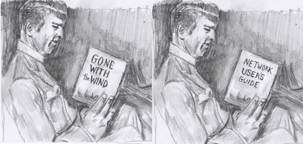
(Drawing based on a photo of Clark Gable.)
Reading Modes
First we must distinguish between two critical modes of reading: reading to do and reading to learn. The distinction between these reading modes is an idea from Ginny Redish (which Caroline Jarret expands on here). If you're reading to do, you're searching for an answer to a specific question.
Here's an example of reading to do. You're giving a presentation using PowerPoint, and 10 minutes before your presentation, you're trying to figure out how to separate your slide notes from the projected slide display. In this scenario, lengthy help text is your enemy. You want the answer in as brief a space as possible, and as quickly as possible. You're reading to do.
Ginny explains this mindset in one of her slides:
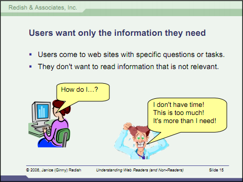
(See "Understanding Web Readers (and Non-Readers) -- Creating Usable and Effective Web Content.")
I'm sure you can guess which guy in the above slide has a PowerPoint presentation in 10 minutes. But consider this other learning scenario. You know you need to improve your presentation abilities, and you're tinkering around with Microsoft PowerPoint. There are so many buttons and features on the ribbon. It's really overwhelming. You're not looking to learn a specific feature, just the tool in general. You may have set aside 20 minutes a day to learn PowerPoint. In this case, you're reading to learn.
Help content will never approach novel-like pleasure reading when a user is operating in the first mode: reading to do. But in the reading to learn mode, there is potential for something other than the frantic, frustrated help-cursing mode.
In Reading to Learn Mode, Length is Irrelevant
Let's stay in the reading to learn mode. As long as the content is business relevant, entertaining, and simple to understand, there's no reason to doubt the reader's ability to become immersed in the content for long periods of time. Length becomes much less of an issue in this mode.
I don't have hard evidence for assertions about length, but in Wired, Clive Thompson notes that the most popular blog articles are about 1,600 words per post ("Clive Thompson on How Tweets and Texts Nurture In-Depth Analysis"). This is about a seven-page essay. Writer/editor Tim Rich notes an eye-tracking study from Poynter showing that users skim until they find relevant content, and then they read for longer periods of time. Many other readers tell me they regularly consume long novels, and even wish the novels were longer.
Clearly in some contexts, length is not a problem. When content is interesting, you can have it any length you want. In one of Tim Rich's posts, he quotes comedian Jerry Seinfield, who says, “There is no such thing as an attention span. People have infinite attention if you are entertaining them” ("Attention Spans").
I think most will agree that text can be long and still be acceptable to readers. However, the real question is whether help content can be long and still be acceptable to readers. If not, why?
Is the Genre of Pain an Exception?
Let's consider a basic reality. Help content is in the genre of pain. It's right next to the tax code, your car manual, and a trip to the dentist. But does help always need to be trapped into a category of boring text no one wants to read unless they absolutely have to? Must it always be on par with a trip to the dentist?
Going along with the dentist metaphor, can the dentist ever change the experience so that you actually prefer to lengthen the visit? His fundamental activities, drilling, sticking his hand in your mouth, doing painful things to your teeth -- it's never something you want to prolong. Just like the tax instructions, no one wants the experience to be any longer, for goodness sakes. The last thing we want to do is extend the pain, right?
But Shorter Does Not Mean Less Pain
Although we do not want to prolong the pain, shorter is not always less painful. In fact, sometimes brevity increases pain. Imagine a tax booklet instruction that was just two paragraphs long. To the accountant writing the instructions, trying to keep it “as simple as possible, but not simpler,” as Einstein says, he or she may look at the concise set of instructions and feel satisfied. But this concision will likely leave me in the dark. I'll end up scratching my head trying to understand terms, wondering if I'm interpreting it correctly, wishing there were some more examples and clarification. The time I save with shorter text is balanced by increased confusion time afterwards.
What we really want isn't brevity. What we want is simplicity. As Whitney Quesenbery points out, “the repeated complaint about ‘too many words' isn't really about the word count, but about the density of the information and how this makes us feel about the information.”
When you hand users a two-page quick reference guide, their faces light up with excitement because they think the application must be simple. Project managers are cheering as well because the brief instructions seem evidence of a simple application, which means they did something right.
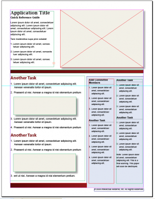
But in reality, a two-page instructional document (such as the one on the right) for a complicated application may only leave users confused. As users make their way through the quick reference guide, they may encounter even more frustration than they would with a longer guide.
In a world of extreme concision, the novice user may be especially lost, like a hiker with a dim flashlight trying to navigate out of a rough patch of woods. The dim flashlight may be small and easy to carry, but in this situation wouldn't the hiker prefer a larger floodlight instead?
As I said, what users really want isn't brevity or shorter texts. They want simplicity. Who wouldn't mind a 20 page guide if it were full of clarifying illustrations, examples, screenshots, and maybe even a glossary?
Illustrations and Simplicity
If simplicity is the goal, not brevity, you can implement a variety of techniques to simplify concepts. One of the most important strategies will be illustrations. Nothing clarifies a concept more than accompanying it with an illustration that drives the point home.
Before I push illustrations too much, let me start off with a caution raised by Tim Rich. Rich says,
There are times when a striking image expresses something in a more powerful or accurate way, but there are also countless occasions when words are an extraordinarily moving or precise media, when words can do more, say more, show more or achieve more ("On Pictures and Prose").
In other words, images are often overrated in their ability to communicate information. A well-written paragraph full of description can sometimes communicate more information than an image. But without getting into semantic contests between text and images, I think we'll all agree that combining the two is almost always a winning strategy. To keep the reader's attention as you move through concepts and strategies, insert a concept diagram on every page, separating blocks of text.
A concept diagram explains a concept visually rather than merely decorating the page with a pretty picture. The concept diagram reinforces an abstract idea through visual means. Here are a few sample concept diagrams from Robert Horn's Visual Language: Global Communication for the 21st Century (p.60).
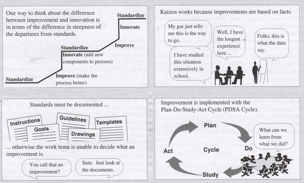
As you can see, you don't need to be a great artist to create a concept diagram. All you need is some basic graphics abilities and an idea of how to communicate your ideas.
If illustrations are so helpful in simplifying concepts for users, why don't more technical writers illustrate their help? Several reasons:
- Lack of graphic design skills (or feelings of inadequacy in a world of professional expectations).
- Lack of conceptual material to illustrate (it may all be procedural).
- Not enough time to create the illustrations you need.
- Difficulty in coming with a clever way to depict an abstract idea.
All of these reasons contribute to a text-heavy help. But if writers were to focus more effort on illustrating help content (and not in an Ikea-like way), you would see a complete turnaround in the reception of help content. Length would become less of an issue, and readers would welcome help content openly rather than resisting it at every level.
Screencasts
Illustrations aren't the only solution to helping users learn a complicated process. Videos are also key. A simple screencast takes just several hours to produce. The dynamic visual interface combined with your human-narrated voice can have a powerful influence on user learning, since it allows users to see tasks in the context of an interface.
I've written about screencasts and voiceover techniques at length on my blog, so my purpose here isn't to explain techniques, but merely to suggest that writers include more screencasts. Screencasts should be a more common deliverable than they currently are. Right now, based on my interactions with other professionals, I'm guessing only 1 in 10 technical writers creates screencasts, even though screencasting software applications such as Camtasia Studio or Jing are simple to learn and use.
Relevant Content
Another element required to convert help into a more pleasing reading experience is to focus on relevant content. A lot of times, we technical writers explain how to use a software application, but we leave the details of the particular business context alone. I know that when I worked as a technical writer for a financial firm, I rarely wandered into business context and use, preferring instead to merely describe how to do various functions in the application.
Why didn't I describe more of the business use? Financial analysis is complicated, and uses are multiple. I clearly ran into the edge of my knowledge of the subject matter and didn't feel comfortable getting into more in-depth business strategies and uses.
However, often the business context is more important than mere how-to within the interface. Many users, especially tech-savvy ones, can get the hang of an application easily enough. Look at even the simplest of apps out there -- Facebook and Twitter. People aren't clamoring for instruction on how to post updates to these web applications. Instead, users are confused about how or why they should even use the applications at all. In what contexts would they be useful or strategic? Why is it that nearly everyone has a Facebook account, but only a fraction of these people actually uses Facebook? Same with Linkedin and Twitter. The instructional material about business use and strategy is perhaps lacking (or unpersuasive).
Most help material has the same problem. The writer explains how to run a report, for example, but doesn't say why the report might be useful, or how you might interpret the report, or who would be the most relevant audience for the report.
As another example, look at Google's Chrome comic documentation.
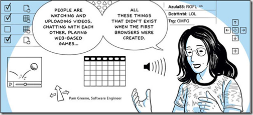
When this first came out, it looked cool. I tore into the first few pages with a new-found enthusiasm, because this format seemed to open up documentation into a world where it was fun and fresh. But after about five pages, I lost interest, as did many other people who started reading it. It seemed to get boring and somewhat irrelevant, as well as technical, and so I clicked elsewhere. A cool idea, still, but perhaps not enough focus on business relevant content. (By the way, I have not seen Google produce any more comic documentation since then.)
There's usually an entire dimension to help authoring that is missing from most help material: help about the business context and use. That's the manual I would pay for, not the simple how-to about tasks already intuitive in the interface. And when you start delving into relevant business content, you have the power to keep a user's attention at length.
Conclusion and Disclaimer
I'm not saying all help material needs illustrations, screencasts, and business relevant content, because every application or project is unique, and clearly generalizations don't always apply. But as a guideline to follow, help could be a lot better if it more often contained these elements.
If you do include illustrations, screencasts, and business relevant content, you might not need to worry so much about brevity and word count. Your users won't glance at a giant block of uninterrupted text and throw up their hands in exasperation. They may even start reading page after page with interest, forgetting about the time or page number.


