Visually Appealing Documents Combine Text with Images
A few years ago, I was scouring magazines to get ideas for quick reference guide layouts. In particular, I found that WIRED magazine has some of the most creative and engaging layouts, often with text laid out in three or four columns, or along the side of a graphic, or in various quadrants about the page.
I was trying to figure out the right layouts that would give my quick reference guides the same eye-popping appeal when I realized something: Almost all magazine layouts have a dominant image that the content revolves around. Without the image, no matter what you do with the text, no matter how you lay it out, your design won't jump out at the reader. To make an attractive quick reference guide, you need a strong image.
In many cases, that image might just be a screenshot with some callouts around it. That is probably the easiest approach for technical writers. But if you have some Illustrator or Photoshop skills, you can go beyond the simple screenshot and create a concept diagram or other illustration.
Neglecting images is one of the most common missteps in tech comm. We rely entirely too much on words. And while I enjoy writing, I'm also trying to become more visual savvy -- because I know that words combined with images result in incredibly appealing documents. And by images I don't just mean a series of screenshots. We all know what those kinds of manuals look like -- the ones with a screenshot after each step.
Leveraging images to illustrate concepts provides a refreshing experience for the user. To see concepts illustrated in graphics, or in other words, to see an idea, engages us. That's really the appeal of the visual, especially the infographic -- not just to have some eye candy, or to see a screen, but to see an idea.
Too often we dismiss our visual endeavors because we aren't comfortable in making graphics. But I've come to learn that executing a mediocre graphic isn't tough. What's tough is coming up with the right way to illustrate an idea. It's hard to find a way to depict an abstract idea in a concrete, visual way.
Even if you work with a graphic designer, often the graphic designer will ask you what you want him or her to draw. You will still probably have to do the work of visual imagination, sketching out how an idea might be illustrated. But here's the redeeming quality: coming up with these idea sketches is incredible fun. It's challenging and creatively fulfilling at the same time. In a lot of cases, the illustration doesn't need to be too technical to convey a message. The simpler and less ink, the better.
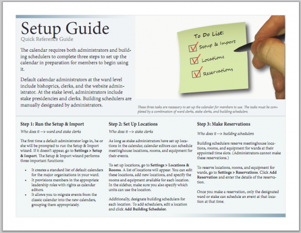
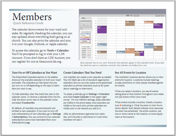
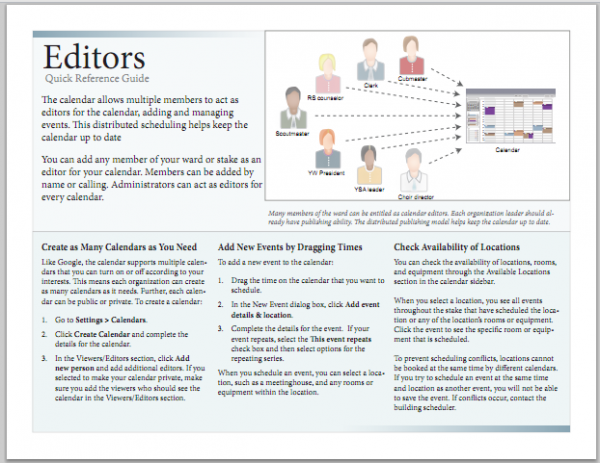
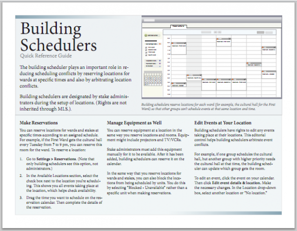
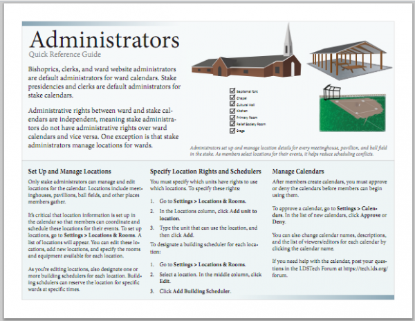
Here are a few one-page quick reference guides I've been working on lately. Notice that they combine text with images.
Each guide has a strong image, and then a few columns of text. That's all. The images aren't necessarily eye-popping (like with images in a magazine), and two images are just stylized screens. But in general, the combination of text with images creates more appealing documents.
No doubt writers shy away from images for a variety of reasons, especially when text requires translation. If the images have embedded text, they can't be translated. One "easy" solution might be to make wordless images. However, removing all words from an image cripples the instructional power of the image. It draws the reader to look at the image, but because the image doesn't have a strong message to communicate (not having any words), it leaves the reader with a blank message. Or the image merely becomes decorative.
One way to get around this is to create your images in Illustrator (or some other graphics program), and then place the images in your InDesign file. Then create text boxes in InDesign and overlay the text boxes on the image. Then group the text boxes and the image. If you have have some advanced translation experts, who know how to export from InDesign to XML and then import again when it's translated, it's a technique that will work. If your output is online, you could implement the same strategy by making the image a background image, and positioning the text with CSS.
Incorporating images into technical documentation poses challenges, for sure. Not only is it hard to visually depict an abstract idea, you have to also be familiar with graphics tools to execute the idea, and then you may need to handle translation as well. Still, despite the hassle, the end product will be much more enticing to readers if you include images.


