Why Do We Need Navigation At All?
 In Designing Web Navigation, James Kalbach starts out by asking why we need navigation at all. Technically, it's possible to put all the content on the same page. You can show and hide the content through Javascript or other techniques. Although he doesn't mention it, technical writers are probably familiar with twisties, or drop-down hotspots. You click the link and a lot of text expands below it. You could essentially do this with your entire help system, putting all the content on one page.
Kalbach points out that Alan Cooper, a long-time usability expert, says websites might be better without any navigation at all. Cooper writes,
The artless web sites created during the Web's infancy were of necessity built only with simple HTML tags, and were forced to divide up their functionality and content into a maze (a web?) of separate pages. This made a navigation scheme an unavoidable component of any web site design, and of course, a clear, visually arresting navigation scheme was better than an obscure or hidden one. But many web designers have incorrectly deduced from this that users want navigation schemes. Actually, they'd be happy if there were no navigation at all.
...Skilled web developers using modern browsers and site construction tools such as ActiveX and JavaScript can create easier to use single-screen interactions that don't require jumping around from page to page. Yet many web designers continue to divide, and divide again, their sites into many fractured pages. These hierarchical arrangements of screens force them to impose a navigational burden on their users. ("Navigating isn't fun," Cooper Interaction Design Newsletter (October 2001), qtd. in Designing Web Navigation, by James Kalbach, p.5)
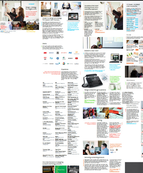
The source of Cooper's quote is from a 2001 newsletter article, "Navigating isn't fun," and since I could not find the original source, I assumed Cooper had since changed his mind about navigation. But quickly visit cooper.com and you'll see that although a navigation menu appears at the top, all the content is on the same page, so by clicking a navigation option, the page content slides around to put new content in view.
Here's the same page but zoomed out a bit so you can see all the content on it.

(His site kind of reminds me of Prezi, if you've seen that. With Prezi, all your slides are on one canvas and you slide around from one section to another rather than flipping from one slide/screen to another.)
You could conceivably construct help in the same way, putting all the content on a single page. Rather than presenting a table of contents on the left in a sidebar, you could insert all the content on the same page, collapsed in various headings and nested like a Russian doll set, or more artistically sectioned off into various quadrants like Cooper does. Would this make it easier for users to find the content they're looking for? Does anyone really use a table of contents to navigate anyway?
Here Kalbach presents one of the most convincing arguments in favor of web navigation. The problem with removing navigation is that "people wouldn't have a sense of beginning or end in their search for information, and orientation would be difficult" (p.6). Without the hierarchy of a table of contents, users would lack a sense of the whole, the beginning to end structure of the content. Kalbach then says, "Navigation provides a narrative for people to follow on the Web. It tells a story--the story of your site. In this respect, there is something both familiar and comforting about web navigation. The widespread, seemingly natural use of navigation to access content on the Web reflects its strength as a narrative device" (p.10).
In other words, your navigation, which presents a hierarchy of information to the reader, gives users clues about the meaning of the content by mere fact of its organization. For example, when you can navigate deeper into the site, you aren't simply moving to a page, you're unconsciously comprehending the relationship of one piece of information to another. The deeper you go, the more granular and specific the information, Kalbach says. The organization of the content tells a story that the individual topics don't reveal alone.
Kalbach says, "In general, navigation offers visitors a semantic peripheral vision of a site's content. This provides cues for its relevance to your information needs. It reveals what's available and what's not, and lets you know you're exploring the right topic" (p.13).
The table of contents provides the context for information that proves to be invaluable for assessing and understanding what you're reading. When you can see that one topic is nested below another, or that it's grouped with another on the same level, this hierarchical relationship provides a context that means something. It's the semantic peripheral vision, as Kalbach says.
Coming back to Cooper.com, to be fair, he does provide a navigation menu, with two levels of hierarchy. Whether that conveys the semantic understanding of a more traditional web navigation system, I'm not entirely sure. (Mostly to me it seems odd/novel/weird.)
Regardless of how you organize the content, the larger point is this: giving users a table of contents does much more than simply provide users with a means of navigating the content. The table of contents expresses the hierarchical relationships of your content, and by so doing gives users a sense of your content's overall story and structure. Even if users can't find the answer to their question by navigating the table of contents, they can find other meaning in browsing and perusing the structure of your content.
In fact, Kalbach says that when people browse the table of contents, they are much more likely to read topics they didn't initially set out to find. In that sense, the information the navigation communicates motivates the user to learn more.


