Retina Display and Screen Capture Sizes in Online Help
If you have an iPhone, iPad, or other device with a retina display, you probably noticed that images appear crisper than on your regular computer monitor. The retina display significantly increases the number of pixels per inch that fit on the screen, increasing the resolution of the images.
What does this mean for technical writers including screen captures in online help files? In short, use larger images and scale them down in the browser rather than with a graphics editor. This will increase the file size, but it will also make the images a lot crisper.
Let's look at a quick example. If you have an iPhone or iPad, look at this same post -- yes, the one you're reading right now -- on your Apple iPhone or iPad device. (Go to http://bit.ly/RLfDrR for a shortened URL.)
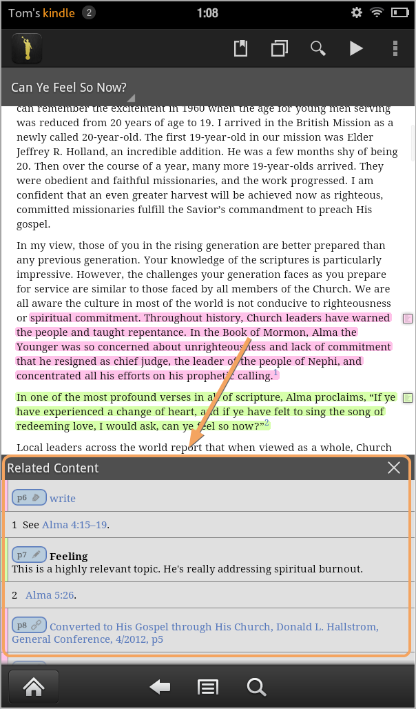
Below is a sample screenshot from a tablet app. Its dimensions are 604px by 1028px.

(This screenshot is from a mobile app I recently documented.)
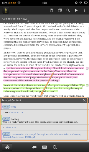
Normally, this screenshot is too large to include in an online help file. Not only are its dimensions large, it's file size is 145KB. The traditional approach would be to scale it down in a graphics editors to a smaller size before adding it to my online help. I'll resize the image to half this size using a graphics editor such as Snagit.

The file size is now only 80KB, nearly half the size. This smaller file size increases the loading speed of the image. The tradeoff is that the image is a bit fuzzier. On a computer screen, because monitors display only about 72 DPI, the Snagit-resized image would look about the same as a scaled down image in the browser, right?
This isn't the case with a retina display. Here's the same full size image with some height and width dimensions applied to it so the browser scales it down (instead of scaling it down with a graphics editor):

On a regular computer monitor, the previous two images look about the same -- both a bit fuzzy. But on a mobile device with retina display, the last screenshot is clearly sharper than the screenshot I resized with a graphics editor. The last screenshot is just as sharp as the first screenshot.
Application to Tech Comm
For technical writers, this means that when we include screen captures into help that will be viewed on a mobile device with retina display, the screen captures will be a lot sharper if we use larger image sizes and scale down the images in the browser rather than resizing the images beforehand in graphics editors.
I usually don't resize my images in graphics editors anyway, since I use Flare. I generally have Flare automatically scale the images to the sizes I've set. But now I'm thinking that I probably won't do this (at least not for mobile targets).
If you want to use the larger image file sizes, don't select Flare's "Generate resized copies of scaled images" check box shown below.

This setting will automatically convert a 600px image (with a filename like samplescreenshot.png) to a different file size based on your manual scaling. The regenerated image file will end up looking something like samplescreenshot_300x511.png to reflect the resized dimensions.
For desktop help, this option is usually extremely helpful. But maybe not for mobile.
Instead of selecting this option, let the image be inserted at its full size, which may be twice the dimensions.
Then edit your stylesheet and add some responsive queries to tell the browser to resize the image instead. For example, add the following:
@media (max-width: 480px) {
img {
max-width:100%;
}
}
@media (min-width: 481px) {
img {
max-width:302px;
}
}
Flare will strip out these media queries, so be prepared to add them back in. (Tip: It would be great if Madcap were to release an update to Flare that didn't strip media queries out of its mobile target.)
Once you add the media queries back into the stylesheet, the browser will show the image at these smaller sizes. For devices with 480px screen sizes and smaller, the image will expand to fill the maxiumum width of its frame, which isn't a whole lot given the small size of the device. The larger image will rescale and display crisply in that space.
For devices larger than this, the max width will be 302px.
Here's that same image scaled down through a media query instead of through height and width dimensions in the image embed code:

If you look at the code, you won't see any height and width dimensions applied to that. It just looks like this:
<img title="Sample screenshot at full size" class="sample" src="https://s3.us-west-1.wasabisys.com/idbwmedia.com/images/samplescreenshot-1.png" alt="Sample screenshot at full size" />
(Also, if you look at this same post in IE8, you won't see any resizing, because IE8 doesn't support media queries.)
Using larger images will impact the download time of the web page, but not that much. Instead of a 80KB file, it will likely be about twice that, 145KB. For some users on weak cellular networks, it might be an issue. But for most, the download speed will be negligible.
More importantly, the screenshot will be clear and crisp for the user. This can be especially important if the screenshot shows text.
Now, whether you include screenshots in a mobile output is another discussion altogether, but I'll save that for another post.
Additional Reading
For more information on retina displays, see these posts:
- Retina Display: The Future of Web Design
- The Effect of Retina Display on Web Design
- Designing for iPhone 4's Retina Display
- Designing for iPhone 4 Retina Display: Techniques and Workflow


