Reinventing the table of contents
I've been exploring different ways to create a table of contents (TOC). Traditionally, user guides have a long TOC in the left column of each page. This works all right when you have about 50 pages, but when you scale up the doc set to 500 pages, the TOC becomes a bulky, unusable mess.
For an example of the mess I'm talking about, see this TOC in Salesforce's documentation. An all-encompassing TOC model like this essentially repeats the initial Yahoo directory of the web, when Yahoo tried to provide an organized hierarchical table of contents for everything. Why present so many TOC options that aren't remotely related to what I'm currently viewing?
A better model for a TOC is to show only links relevant to a narrowed scope. (I explored some of these ideas in an earlier post here.)
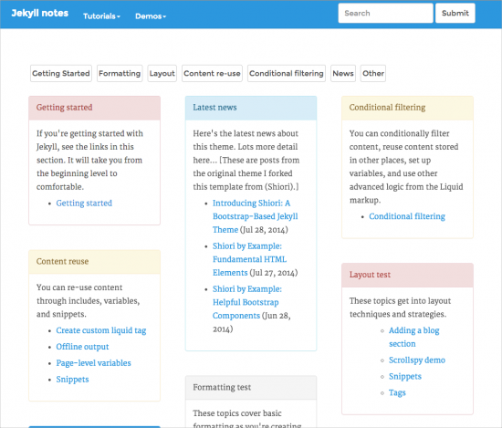
Take a look at my evolving Jekyll prototype. The homepage has various panels (like Pinterest) that you can dynamically filter.
When you jump into a page (such as Syntax highlighting), a mini-TOC appears on the left (if the page has subheadings).
To go back to the main panel page, go to the homepage (by clicking the product title in the upper left, "Jekyll notes"). This kind of scope filtering seems more practical for scaling doc sets.
BTW, the shuffling feature on the homepage is through a JavaScript library called Shuffle.js.
(Also, much of the content on this prototype is a mix of filler content + informal notes, so don't pay attention to it.)
What do you think? Does this model reinvent the TOC in a better way?


