Examples of linear workflow user maps built with JS and CSS
Map background
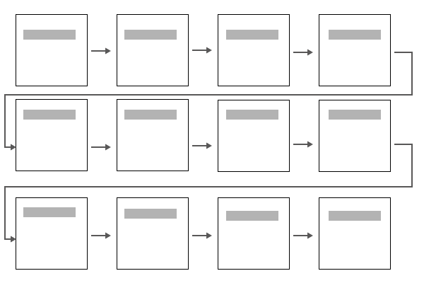
I’ve been thinking more about user maps lately. My first user map looked like this:

The feedback I got was that it was too massive. It made the process look really complicated.
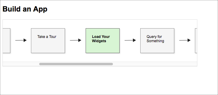
In another version, I made the workflow scrollable (and in one row), with a specific workflow highlighted:

Here’s the JS Fiddle:
The underlying code is all HTML, JS, and CSS. The idea is that you create the map in one file, and then include the file at the top of each doc page where it applies. On each page, you add a small JS script that specifies the scroll position and CSS that specifies which box is active. If you have 20 workflow squares, that’s okay — the scroll position automatically moves to the workflow square in view.
However, when I showed this to my wife, she said she didn’t like having to scroll. She wanted to see the whole map at once. I agree that having to scroll is less than ideal. 99% of the time, horizontal scrolling is a fail with user design.
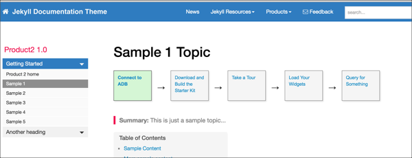
So I made another version without scrolling, which you can see here: Sample 1. Click through each of the pages in the workflow to see this in action.

I like this example, so I coded it into my Jekyll documentation theme. You just add some values in the frontmatter like this:
map: true
map_name: usermap
box_number: 1
The page.html file in the _layout folder then includes this code:
{% if page.map == true %}

<script>
    $(document).ready ( function(){
        $('.box{{page.box_number}}').addClass('active');
    });
</script>

{% include custom/{{page.map_name}}.html %}

{% endif %}
In Jekyll, the {{page.}} code accesses any properties you add in the page’s frontmatter.
Here’s the single usermap.html file inside _includes/custom:
<div id="userMap">
            <div class="content"><a href=""><div class="box box1">Connect to ADB</div></a></div>
            <div class="arrow">→</div>
            <div class="content"><a href=""><div class="box box2">Download and Build the Starter Kit</div></a></div>
            <div class="arrow">→</div>
            <div class="content"><a href=""><div class="box box3">Take a Tour</div></a></div>
            <div class="arrow">→</div>
            <div class="content"><a href=""><div class="box box4">Load Your Widgets</div></a></div>
            <div class="arrow">→</div>
            <div class="content"><a href=""><div class="box box5">Query for Something</div></a></div>
<div class="clearfix"></div>

</div>
This user map consists of div tags because they behave better than tables.
Here’s a JS Fiddle with the code:
What happens if you have more than 5 steps to follow? While you could create multiple rows, I think this would be unwise. It’s probably better to link to a full view of the map. This list of five steps is a zoomed-out version of the larger map.
Although this approach probably works all right, it still doesn’t show a more complex workflow, where there are multiple paths, optional steps, and maybe a decision tree. For that, I think I would have to design the map in Illustrator. (More detail on that will come in the next post.)


