Zooming out and in with navigation
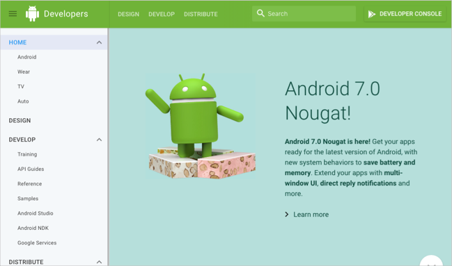
Here’s a short (silent) demo of how the Android navigation moves horizontally left to right:
I have no idea how the sidebar is assembled on a technical level. It seems like a nightmare to maintain, honestly. And from a usability perspective, it doesn’t entirely orient me to where I am in the documentation. (The documentation is probably too massive for me to feel comfortable to understand its entirety through a simple sidebar hierarchy.) But the sidebar combined with the breadcrumb does as good a job as one can expect. And it does give me an idea of where I am without presenting a massive, never-ending list of sidebar items.
For example, if I view the Creating an Android Project topic, I can see from the breadcrumb exactly where I am in the site hierarchy: Develop > Training > Getting Started > Building Your First App.
The higher level items (“Develop > Training”) don’t mean a tremendous amount to me. But “Getting Started > Building Your First App” does. And if this isn’t the right topic but perhaps another tutorial is, I know that I can go back up to “Training” to see other tutorials.
Overall, the Android site is really a work of art. It’s not perfect, but the site does an amazing job at providing a seamless, organized, and thorough arrangement of a mountain of documentation content.
At my work at Amazon with the Developer Portal, we’re in the middle of a site transition from an older CMS to a new, home-grown platform. The site doesn’t have nearly the same amount of content as the Android doc site, but there are a number of products, many of which overlap with their documentation. For example, whether you’re submitting a Fire TV app or Fire Tablet app, you go through the same app publishing steps.
Much of the tech doc content is still in the older CMS. You can see an example with the Fire TV documentation here. The built-in navigation on the left doesn’t provide control at a sufficiently granular level for technical documentation. So as an interim measure, we built another doc navigation sidebar on the right that helps improve the navigation among pages in a documentation collection.
If you look at the bottom right, at “Documentation Categories,” you’ll see that I’ve arranged the content into various groupings:
- Getting Started
- Catalog Integration
- Fire TV Web Apps
- Fling SDK
- Appstore Publishing
(By the way, the end-user documentation for Fire TV is on an entirely different site, so there’s no need to distinguish between third-party developer documentation, which is for developers building apps for Fire devices, and end-user documentation, which is used by mainstream users who use Fire devices.)
The content in the previous CMS was more or less flat, like a wiki. Beyond some high-level categories, the principal means of navigating from one topic to another in the documentation was through in-page links. Although in-page links are helpful, they don’t necessarily facilitate the ability to take in the available information in the documentation as a whole, nor do they help you understand the context of the information at a macro level.
I believe that each documentation group should have a persistent sidebar that allows users to navigate all topics within that documentation group. But by “documentation group,” I don’t mean a massive, all-encompassing list of documentation that almost looks like a sitemap. Instead, I’m referring to a logical collection of topics, somewhere between 10 and 30 topics, which fit together.
Some groupings are obvious. For example, all documentation related to the Fling SDK naturally fits together in a group. The “Fire TV – Getting Started” category is a little more ambiguous. It’s kind of an introductory/miscellaneous-development category.
Eventually, as the site continues to evolve, these documentation groupings will take shape in the new look and feel of the site, and hopefully our navigation controls will become more intuitive and seamlessly woven throughout the site.
But regardless of the actual design it eventually conforms to, the ability to zoom out and in within documentation is important. And understanding just the right magnification level that users need to see is an art. If you have too many topics in a sidebar, one ignores the sidebar because it’s just noise. Too few, though, and it’s hard to see where you are or what else is out there. Building the zoom-in/zoom-out controls within the sidebar seems like a best practice for finding a balance between the two macro/micro extremes.


